Showing posts with label fashion history. Show all posts

Thursday, July 19, 2012

Sleeveless / Convertible Spencer: Embroidery Completed!

At long last, eh? I started the embroidery in late April, and here it is, practically late July. The project started October 26, 2011. How's that for glacial movement?

Ta-da.


I've worked on the project in bits and drabs, obviously. Sure wish I'd kept careful count of the hours, but would say it varied from 30 minutes to 1 hour per complete motif.

Can you find the single blue motif? Why is there only one when the effect is so nice? I meant to use more of that color. Let's make up a myth to explain it. What shall it be?

The embroidery is sparse, similar to both extant spencers in the Metropolitan from which my design is inspired. It will feel tighter, however, when the seam allowances are turned and the pleating is added to the neckline.

American or European spencer, 1800-1830
Metropolitan Museum of Art


C.I.38.100.10
Late 18th century spencer
Metropolitan Museum of Art


1970.281.1
Now for construction, if I remember how to do it :}

Today I leave you with a bit of the silly season --

Three friends outside the entrance to the formal garden at Ashland Estate.

Sunday, May 13, 2012

Sleeveless / Convertible Spencer: Embroidery Experiment 2 a Success!

The working milieu
After the annoying and coarse results of the first embroidery experiment, I decided to order flat silk thread that would divide more easily. When the Eterna silk thread I chose finally arrived, however, most of the threads I had ordered turned out to be out of stock, and the few colors that I did order lacked the fine shine of the Au Ver a Soie thread, although the threads certainly divided easily and so could be used for fine motifs. Depression. What to do?

I thought of ordering the gorgeous Japanese flat silk that Hallie Larkin of At the Sign of the Golden Scissors discussed in her recent embroidery post, but it goes for $7 a spool, and even though you get 60 meters per spool, I don't need 60 meters of any one color and would have dropped over $50 on more thread.

Depression deepened. I set the project aside to sulk.

It kept calling out to me from the closet. I listened, disgruntled, but gave in.

A sunny afternoon found me on the pine floor in the kitchen, with a 20" thread of the Au ver Soie on my knee, and a long, narrow beading needle in my fingers. I attempted to use the needle to divide the silk filaments into narrow strands. Both Hallie Larkin and Mary Corbet said it could be done, with care. Indeed, the almost liquid silk DID divide, half-way through. Then it fuzzed up and tangled. I picked it up in my fingers in desperation, and slid it through them back and forth, between my fingernails, attempting to work out the tangles.

A miracle. The tangles smoothed, the gloss returned to the silk, and it flattened out, easing into a tiny rivelet of vibrant color.

I had a thought. My applique needle had a round eye but my beading needle a long narrow eye. What effect could I attain if the silk were truly applied so that its filaments were all laid out really flat, flatter than they could become when trapped in a round-eyed needle?

The silk easily threaded the beading needle, and did lie in my fingers quite flat. I took an experimental stitch, and in a second burst of inspiration, changed out my laying tool, a long pin, for the flat side of a seam ripper, and when I finished the stitch, I ran the seam ripper along the threads underneath, guiding them into flatness. The result was lovely and smooth, with the many filaments laying side by side reflecting light and looking like many stitches, not just one. Could this be repeated? I brought the project upstairs, into more even light.

The beading needle's length was a help, because I could find the placement for the next stitch without a shadow or fingers getting in the way of my eyes. The second stitch worked too. The third not so much, but I kept trying.

I worked a basic flower shape in laid stitch in a deep coral pink, and then threaded a narrow section of Eterna silk, and overlaid the centers of the petals in a light pink. The laying tool flattened and guided each stitch into place.

Then, after all the stitches were placed, I ran the flat side of the seam ripper laying tool under the stitches composing each petal and worked with them, repositioning the threads, and making the light pink thread nest down into the coral color. I "petted" and stroked each stitch to flatten and straighten it. I'd read or heard (was it Robert Haven who told me when several of us toured the UK Costume Department in January) that you could do this, and for Pete's sake, it worked.

Here is what I ended up with. In the image the Eterna silk (the inexpensive Chinese dividable silk) is threaded in the beading needle; the seam ripper and the coral Au Ve a Soie lie nearby. I am very pleased with this second effort. If you consider that each petal is the size of a woman's pinky nail -- about 1/4" -- when looked at with ordinary eyesight and not the camera's magnifying lens, it's pretty darn satisfying.


So that's what I will keep doing! I'll pet and poke and massage and primp the stitches until I have them the way I want them, and the handsome little flowers will soon start blossoming all over their lilac ground.

Let's look at the original Met spencer again. Here's a similar flower. The flower center is a single spangle. If you look at the little divots at the end of each stitch, and especially at the light pink sections of the petals, you notice that there aren't that many stitches composing each petal...there are lots of filaments of flat silk, but not that many threads. When I had last looked at the flowers, I had focused on the filaments. They are numerous and make you think there are lots of actual threads, but it's not so. The low number of stitches is even more evident in the leaves.

A similar flower design, from the original Met spencer.
 A final note: really good light is essential for this kind of embroidery. You want indirect bright light, and as few shadows as possible. This table sits at a double window, direction north-northwest, and it's barely good enough. A sixty watt bulb at night is not enough at all, and a bank of overhead lights only causes shadows, at least in my house. I've had to experiment a lot.
Good light is essential.
 So, onward ho, the greenery on this flower, and 15 more flowers to go!

Saturday, April 21, 2012

Sleeveless / Convertible Spencer: Experiment Number 1 in Soie Ovale and Silk Chenille Embroidery

Weeeellll, experiment number one turned out two mediocre motifs; the silk ovale thread is too big for the tiny motifs, so the results are clunky, if shiny. Big sigh. I had hoped experiment number 2 would be all about improving the stitch quality; instead, I have to get new thread!


The silk embroidery work so far, under the light of a lamp, to better catch
glints and gleams.

Here are the two motifs, embroidered on a side piece so as to be relatively hidden. If you look carefully, you can see the drawn lines that mark the edges of this side piece. The pins have been used to attach the silk to the edge of my impromptu embroidery frame. The fabric color is corrected to be as close to lilac as possible; the appearance of the petals is a little redder than it should be, but the shine is decently accurate; the thread shines like crazy and it is also taking on the yellow of the incandescent lamp the work has been placed next to.

The completed sprigs; petals in soie ovale, and stems and leaves
in silk chenille.

The petals are sewn with Au Ver a Soie soie ovale from Hedgehog Handworks, the stems and leaves with Hand-Dyed Fiber's silk chenille, narrow width, the gilt spangles from Berlin Embroidery, and spangle and couching thread in Au Ver a Soie Paris twisted silk (a great all-rounder!).

What are the designs I am working from? The sprigs from the Met sleeveless spencer, of course! It was those sprigs that drew me to the funny little garment to begin with. They are handsome little things, not quite high fashion, but not totally naive or provincial, either, and the level of work is nice, when one considers that each motif varies, I estimate, from under an inch to a bit more than an inch and a half high.

I copied the designs as nearly as possible, and colored them in, in pencil, marking the direction of the embroidery threads as well as I could. The colors are a little off compared to the original: I don't have the neccessary shades in my pencil set, or in my embroidery threads, come to think of it. Am going for the spirit of the designs, not a total copy; after all, I am not using that shade of sea blue silk!


The Petals and Working with Soie Ovale

The soie ovale has a sheen like no other thread. Made up of lots of silk filaments, it is untwisted, so it can be made to lie flat and display the full shine of the filament. Being untwisted, each filament is gossamer, like a spider's thread. Together the filaments make rather a thick strand. Mary Corbet describes this silk as having body, and she is right.


The strand is almost impossible to divide into smaller strands, because it's just one bunch of filaments. The strands fuzz and bunch if disturbed by too much handling, and lose their perfect smoothness, even after being run through the fingers.


When worked into petal shapes a quarter to a half inch long, the strands are too beefy, and I have not the skill to lay them pefectly together; the results look coarse, and too naive, if nice an glowy. Look at the closeup below: the quilting pins to the right give you an idea of the size of the motif, and of the thread, and of how few stitches were needed to complete a petal, making the result coarse. (N.B. It turns out the coarse effect is due to how I did the stitches; it's not the fault of the thread. Please read experiment number 2, which came out much better.)


A closeup of a motif.

By contrast, when I examine the threads used in the Met spencer, they are about as thick as the sewing thread used for seams: that's very fine stuff, resulting in relatively exact motifs. They don't have tons of glow., either, through time and wear could have roughened the threads. (N.B. As I learned in experiment number 2, this was not a good motif to look at. Other motifs show a thicker flat silk thread, very nicely laid.)

The Met spencer: closeup of stitchery.

The soie ovale is interesting to work with. It is slippy, it is slidy! It comes off the needly! Even with a size ten or eleven needle, it slithers out of the tiny needle eye very easily. Further, the filaments catch on the fingers, so it's best to have soft hands, not work-roughened ones -- which for this gardening, child-rearing lady, a big Ha! to that -- and to moisturize them well. Laying the threads in laid stitch with a laying tool is essential. Thank goodness it is pleasant and produces a nice flat surface, although I have some glitches, this being my first time at it. And the glow, the wonderful, wonderful glow, pure color that gleams back at you. Even with its challenges, I like working with soie ovale and with much more practice and the right project, should get handsome results.

Yet for this project I need a flat silk that is divisible into much smaller strands so that the motifs won't look so coarse, and have determined on Eterna Silk. It's inexpensive for silk thread and Mary Corbet says it's nice, if not the best. For a garment exposed to wear, it's more sensible. Further, it divides into up to twelve strands, since the main strand has a slight twist. When divided like that, it's downright pennies a yard. (N.B. The Eterna silk turned out to be not nearly as nice as Au Ver a Soie: when well treated, it does glow, and it is easy to use, but it isn't the quality and I am not sure it's being made anymore. The maker's site doesn't answer email and the place I bought mine from is discontinuing it.)

The Stems and Leaves and Working With Silk Chenille

Mixing embroidery materials and stitches happened a lot, it seems. In my explorations of 18th century embroidered garments that have good close-ups (see my Pinterest board), I have found tamboured silk and chenille coexisting, flat or spun silk and chenille coexisting, and goldwork coexisting with both. So it was with confidence that I decided to do the spencer's floral motifs in a mix of flat silk, silk chenille, and gilt spangles.


The silk chenille is fun to work with. I love couching work, and the chenille silk is just plain cute. If you like cats, or any fuzzy animal, really, you'll like silk chenille: it teases you to pet it.


Mmm, mm, good: silk chenille on the spool.

Once I learned to keep the chenille on the reel while couching it down, rather than cutting short lengths, it was easier to work. Short lengths bounce around and are hard to coax into shape. The ends are a bit fussy; you have to secure them with an extra couching stitch and then snip off the end with the point of your scissors right on your fabric (eep!). Shaping the stems and leaves requires forethought, like tambour work or fine soutache work. You have to figure out how, and if, you can run a continuous piece of chenille in order to avoid lots of tiny lengths.


I will be experimenting awhile, as I explore how doubling back on the chenille to keep going with one strand, and placing one layer over another and so hiding colors when a contiuous color is not wanted, works. This project won't require much of that, though. Others will; I note that some extant garments keep to really simple shapes and few tones, while others are like silk painting in chenille, with lots of tiny bits of color impressionistically used to create gorgeous, rich, shaded flowers and swags.


Time Expended

Even with practice, this embroidery will be slow; I am rather chagrined if I bore you.  Each petal stitch is carefully placed and laid with the laying tool. The stems and leaves are faster. I expect two motifs per hour-plus session, with one motif per session when it's a carnation. Since the Met spencer is sparsely embroidered, I have perhaps twelve to fifteen hours ahead of peaceful, peaceable, meditative enjoyment, spread over weeks.


Very little happens fast on this blog, does it? How very un-21st century.


So, What's Next?


I will put the embroidery into hiatus until the Eterna silk arrives. Meantime, I will hem and finish the waistband on the lilac petticoat, the long seams of which I had hand-sewn in the car during our Easter
trip.

That means, next up you'll probably be treated to a petticoat post.

Ciao!

Thursday, April 19, 2012

1790s Sleeveless / Convertible Spencer: Recutting The Neck and an Embroidery Teaser

Over the last week or so the spencer's neckline was recut to a lower, rounded shape. Here is where we started, with a very square neckline, as like to the Met spencer example as I was able to draft it and with seam allowances added: which makes the thing look rather too large. The pieces have been basted to make fitting easier.

Lining fitted, ready to be reshaped.
Reshaping the neckline was a matter folding the shoulder strap fabric into a pleasingly rounded shape, and then folding down the front pieces at the top to complete the curve, while folding up the bottom to shorten the spencer. Here are the rough folded results, pinned carefully. You can see that I have the image of the model spencer up on my computer to aid in the process.

You can see the neckline dip, but it's hard to see the curvature in the
shoulder strap part of the neckline. Trust me, it's there.

The model spencer, Metropolitan Museum of Art, number  C.I.38.100.10, has been dated from 1800-1830, and it has a very high waistline. Since my spencer is late 1790s and I want to fit it to my cross-front dress, I kept the waistline a little lower. I also recut the center closure of the front pieces so that they would lace shut or hook-and-eye shut; I cannot overlap them and pin them as originally planned because of the neckline ruche trim.

I took off the lining, marked all the folds with blue tailor's chalk, cut the basting threads, and laid the pieces all flat. Then, using the rough marks as a guide, I drew clearer, truer curves with the chalk, then took scissors and cut the new shape. The rounding in the neckline continues beyond the shoulders to the back, so I had to cut new shoulder straps and reshape the back neckline to a more rounded shape as well.

Here is what the pattern pieces look like now. The backs of the shoulder straps are particularly wide, because the curve of the neckline really pulls in there. The seam allowances are still very wide, too, for "just in case". They'll be trimmed later.

Recut lining; seam marks included in chalk.
Next up, reading for embroidering the fashion fabric in small sprigs, in soie ovale, silk chenille, and true gilt spangles! The sprigs I copied directly from that Met spencer. Here is a peep:

First experiment in silk chenille and soie ovale.

That's not plastic thread you're looking at, that's the fantastic shine of flat reeled (filament) silk floss, soie ovale from Au Ver a Soie. Like the silk chenille on the little rolls, way fiddly to embroider with, and a very different beast than cotton floss, spun silk thread, or crewel wool, but with experimentation, I will get the hang of it.

Today I leave you with a wish from the boys: they would really like a window seat, they say, and until I removed him for safety's sake, Christopher sat on the window sill to show me how pleasant window sitting is.

Tuesday, April 10, 2012

1790s Sleeveless / Convertible Spencer: Neckline Modification

Last I wrote about this project, I'd just fit the toile. Since then the silk has been dyed lilac, and now is the time to cut out the garment. Yet I can't seem to confidently take scissors in hand to the lining fabric, to create the second toile that will then be the pattern for cutting the silk.

What's the barrier, besides mowing the lawn, polishing windows, weeding, weeding and more weeding, laundry and more laundry, work, childcare, and a happy trip to family and friends in Georgia to celebrate Easter?

It's the neckline. I'm just not happy with it. Here is the toile:


The blue marks show where the toile is cut now; the red ones show the up-to-now modifications. After all, I was going for this sort of front: very low, very open...really 18th century short bodice sans sleeves. (If you look at the endless string of posts on this project, you'll get the history.)


You see, this design might do well with a ruche in the back, like my fashion plate inspiration model below, but can you see the ruche working in the front? Of course not. It would look really silly to ruche narrow straps and then a broad expanse of low neckline. You see, in the effort to make the poor little garment do so many things, I initially thought to tack on the ruche and then remove it as desired, for a different look. Ditto the epaulettes.


I've been looking at ruched spencers since the project began: the Met has lots of them, but not until Sabine of Kleidung um 1800 finished her cotton variation on the theme this past week did I really focus on my own ruching plan...and decided that I'd better rethink the front.

The best plan, I thought, would be a low rounded neck, ruched, or better yet, a vee neck, ditto. Luckily, an extant comes easily to hand, from the Metropolitan Museum of Art, which has quite a selection of spencers, a good number of them featuring a ruched or plaited neckline. This one is perfect in cut for my purposes. It's center-front closing, cut very deeply in the neckline, and has a narrow ruching.

Black spencer, 1800-1830, Metropolitan
Museum of Art, number

C.I.38.100.10


The Met included a fascinating photograph from an exhibition long past showing the spencer on a dressed model.

The Met gives a wide date range for the garment, and given the tiny diamond back, it is very unlikely to be 18th century, though the silk seems to be. No matter, the front cut is reminiscent of late 18th century fashion plates, such as this sleeveless spencer, or body, from 1799.
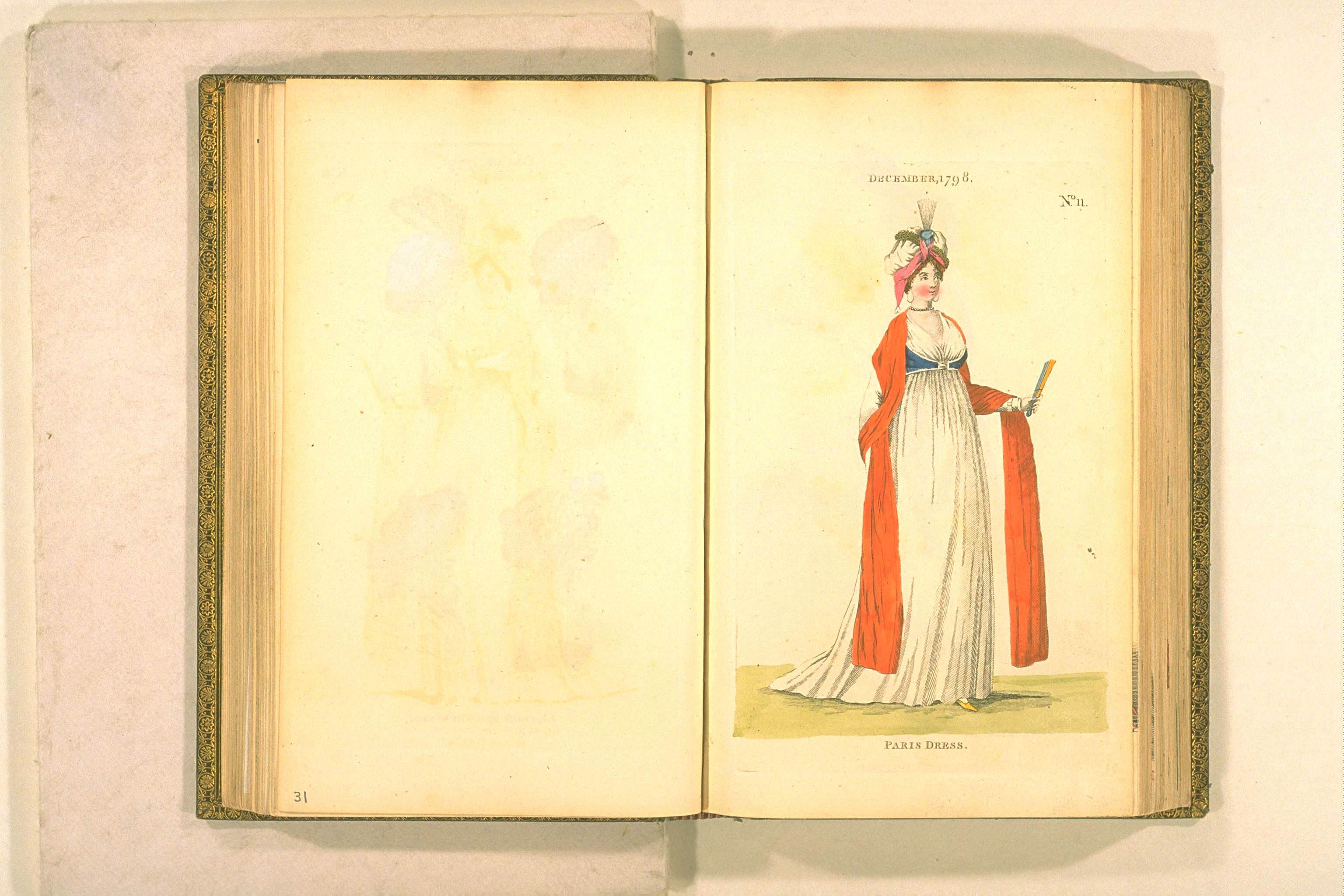
London and Paris Fashions, December 1799
(but appearing in the January1800 number)
Image Bunka Gakuen Library.
 The front works so much better with my wrap-front dress...


Just to show another favorite example. Here's a Met extant with the low round neck, a good bit lower, I might add, then some of the other specimens the Met has with the popular neckline treatment. Here, the ruching has become a careful pleated flat frill, sewn near the neckline, with a header.

Late 18th to early 19th century quilted blue
spencer, with pleated neckline frill. Metropolitan
Museum of Art, number

C.I.50.8.14.


Most of the other examples, and in fact my inspiration fashion plate, employ quite a wide ruche. Sabine did in her spencer, too. However, I think a wide ruche or plaiting, lovely as it is, would overwhelm my sleeveless spencer, so the narrow version in the black spencer above is more appropriate.

There, now I can rest easy tonight. Sometime later this week or next, as time allows, it will be time to cut the lining!

p.s. Ruched jackets were nothing new. The Victoria and Albert has this delightful printed and quilted jacket from France. Look at that neckline!

Printed and quilted linen jacket, France.
c 1785-1790. V&A, number

Wednesday, April 04, 2012

Lilac, Lilacs, and a New Look

The lilacs are in full bloom, and the sleeveless spencer and petticoat silk are lilac-colored!


The silk is true lilac color, although I suppose, since it matches my violets, it could be called that color, too. It was dyed (from the same stash of old cream silk almost slubless dupioni I've had for years) in the washing machine with Idye from Dharma Trading. Easy to use and entirely mess free. The color of the silk when wet was MUCH darker than this, more a royal purple, so when using Idye at least, one must trust that the color will come out well. I was worried it would be too dark and wondered whether I had left it in the dye too long (30 minutes, less than the 50-60 that Idye suggested); had I taken it out earlier it would have been too pastel colored. As it stands, it's nearly the exact shade needed.

From London and Paris Fashions, Bunka Gakuen Library
You can read more about this ensemble in Making the Wrap-Front Dress Do Double and Triple Duty.

At the Jane Austen Festival in Louisville in July, I will probably wear an afternoon variation of this ensemble one day with my wrap-front dress -- with the petticoat showing and a day hat -- and on the other day will wear the sleeveless spencer over the wrap-front dress, with no petticoat showing. A third choice is to wear the petticoat and the spencer together, and add muslin sleevelets to the spencer. Love all the choices!

Lilacs and a New Look

Here are the lilacs in our garden. No purple tint, but definitely a royal fragrance.


Now for the new look. It's an experiment. Because I am doing so much embroidery, with more in the works, it seemed appropriate to feature embroidery in the blog design. Am not entirely happy with it: the header needs centering and I chose the background from a copyright-free image uploaded to Wikimedia Commons from the Victoria and Albert: it's a detail of a mantua's petticoat. The petticoat is from decades previous to "my" decades, and it needs Photoshop work. There are other glitches...more edits over time.

Today I leave you with...

...a shot of the boys watering everything in reach, including themselves. We have had a highly irregular, extraordinary, Technicolor springtime. Everything in bloom at once. From the ground up: vivid green grass spangled with violets and spring beauties, above them nod tulips, azealeas in glory and shading the tulips, under the blow of crabapple and pear and cherry trees, blooming alongside redbuds, and even just over a week ago, forsythia, and over all, most of the trees in leaf, even our walnut. Only the daffodils and very early flowers have gone. I feel like I've walked into Elven territory, it's all so verdant, except that in my heart I know it's not natural and I fret at what summer will bring, if it's 80 degrees now...


Shorts and almost swimming on April 4.
Will Mother Nature shout "April Fools"?

Friday, April 08, 2011

From the Collection: Feather and Horsehair Aigrette

Front of aigrette
Today, something a little different. In preparation for the Jane Austen Festival Ball this July, in Louisville, I've been looking at aigrettes which can be added to turbans. I happen to have one in my collection, and thought you might find it very interesting not only in terms of looks, but also in its construction.

The images are really big, so please click on them to get details. (In fact, if you are on a Windows machine, click again on the big version to see them huge.)

The aigrette is made of a celluloid comb, very flexible, with two gold-painted and curled feathers (species undetermined) and horsehair. Each feather is divided into small sections, each of which is individually curled.)

Construction: the comb has two small central holes in the top. The feathers and horsehair are gathered into a bunch, wound with tiny wire, then fixed with pitch-like glue at the base, then black thread-wrapped, with the thread carried around the glued base, through one hole to the back of the comb, through the other hole, and back round the base of the aigrette again. The thread is carried this way many times through the holes.

The aigrette is worn such that the base is in front. It must be hidden by hair or some other decoration in order not to show the base.

Here is the back of the aigrette. I've set it next to Curtis Grace's business card so you can get an idea of size.
Back of aigrette

And here is another view, in a different light, in case you would like to look at more details.


How old is this aigrette? Curtis Grace, who studied Fashion Design at Parson's in new York and has quite a collection, thinks it late Victorian; he felt it was late 1880s. Aigrettes really didn't go out of fashion after that...you find them constantly in Edwardian and Jazz Age designs.

The aigrette is incredibly delicate and is damaged with but a whiff of air. The comb, merely an eighth of an inch thick, is also delicate.

With these photos, those of you who would like to make aigrettes probably have enough visual information to work with. To get the spiky effect so important to many aigrettes, you can still use horsehair: it is still available for sale for use in the equine industry (tail extensions, anyone?), for violin bows, for hairwork jewelry, and the like. Here is a supplier, M&M Horsehair, just north of here in Ohio. I haven't used them; the link is just here for convenience. Burnt ostrich would also work, although the effect would be a bit different.

However, if anyone needs more information, I'd be glad to try and help.

Sunday, March 20, 2011

The Man Behind Journal des Luxus und der Moden

Friedrich Johann Justin Bertuch. Image
courtesy Wikimedia Commons.
Journal des Luxus und der Moden was one of the first "real" fashion journals, and in which engravings were an important means of communicating what was new.

The journal was the brainchild of Friedrich Johann Justin Bertuch, of Weimar, who was what I would call both an early industrialist -- he ran a whole variety of businesses, of which printing was only one facet -- and booster for his native town.

The journal's "contents were devoted to new developments in clothing, jewellery, furnishings, technology, the fine arts, literature and manners. It set out to educate taste and improve manners, and there was also a section of advertisements", writes Ian Maxted. It made extensive use of local fashions, as well as foreign fashions, English -- for example -- which bothered some, but which the publisher defended.

This was the purpose of the journal, as Bertuch wrote in 1793 in the journal itself:

"As is well known, the purpose and plan of this journal is to recommend the luxuries and fashions of Germany which, properly conducted, can be very beneficial mainsprings of the national economy, but certainly not to do so in a foppish manner, driving them to damaging excess and dissipation, but to supervise, them, to criticize publicly their wilder outbursts, and to subject them to the correcting ridicule of the rational world and good taste. Mainly however our aim is to make Germany more aware of its own artistic prowess, to give our artists and craftsmen more faith in their own powers and more love of art and taste in their work, and to make them knowledgeable about the discoveries and beautiful forms produced by foreigners, above all to secure our purses from the ravages of foreigners."

A cover and fashion illustration from the journal;
Wikimedia Commons lists it as circa 1800 but the
lady's dress is in 1780s style.
Fascinating, eh? I find the idea of corrective ridicule especially interesting, for we have already read some of the scathing things he -- or his reporter -- had to say about 1795 fashions. It reminds me, in a way, of how Vanity Fair sometimes sounds, although, I daresay, hardly in as preciously self-aware a manner.
 
200-plus years later, it's lucky for us that Bertuch did cover a broad cross-section of the fashionable world, for his pictures and his descriptions provide a superb window from which to view costumes and manners.

Read a fascinating biography of Bertuch in the article Bertuch: Weimar's Literary Midwife, by Ian Maxted. It appears online in the Exeter Working Papers in Book History. Many thanks to Ian Maxted for making this resource available. See also a shorter, wiki-style biography of Bertuch on the Art Directory site.
 
Plus, you can learn more about the drawing school Bertuch founded, which supplied the journal with illustrations, in the Weimar Princely Free Zeichenschule pages on Quiki.com, a sort of short wikipedia.
 
Finally, have a look at a whole variety of images produced by Bertuch's concerns on Wikimedia Commons.
 
Happy reading...

Thursday, March 03, 2011

"New Things in Fashion": Fashion Plate No. 23, August 1795, a "Luxus" Translation

A Translation from Journal des Luxus und der Moden

Now, what you just may have been waiting for...the fashion plates and their descriptions from Luxus. So, what's the news for August? Because of the time lapse from reporting to publishing, the reporter dates his news the second of July. Here is the translation of the introduction to the two fashion plates for the month, and then the first fashion plate and its accompanying description.
Photo: Plate 23, August issue

As always, click on any image to see a larger version.

Page 394

2. Aus Teutschland
* * den 2. Jul. 1795

Zu meinem lezten Berichte vom 10. Jun. habe ich Thnen (???) noch beiliegende zwei Figuren nachzutragen, weil sie zwar keine auffallend neuen Moden enthalten, sondern, eben so wie meine vorigen Zeichnungen, nur Muster, wie unsre eleganten Damen sich anjezt kleiden, liefern.

Die erste Figur, (Taf. 23.) ist eine junge Dame in einer Chemise von Linon, mit kurzen Armeln, woran der Leib under der Schärpe mit gefalteten Spizen garnirt ist. Die Schärpe von blauem Bande ist vorn unter der rechten brust in eine Schliese gebunden davon die Enden herabhängen. Das Halstuch ist unter den Armen durchgezogen und unter den Schultern geknüpft. Um den Hals ein schmales Collier von weissen Spizen; das Haar geschlängelt-

page 395

raus und fliegend; der Aufsas ein Bandeau von weissem Linon mit zwey Schleifen, und Festons von Perlenschnuren, worin ein Puf von blauem Atlas steht, welches nach hinten-zugetheilt ist, vorn ein kleiner Federstuz -- vollenden das eleganten Negligee meiner Dame.

2. From Deutchland
the second of July 1795

To my last report from June 10, I have still the adjacent two Figures to add, because they indeed contain no fine, remarkable new fashions, but rather, as with my previous examples, they furnish only patterns of how our elegant Ladies are now clothing themselves.
The first Figure, (Plate 23), is a young Lady in a Chemise [dress] of linen, with short sleeves, whereof the body under the sash is garnished with folded lace. [See my note, below.] The sash of blue ribbon is tied in a bow right under the right breast, from which the ends hang. The fichu [literally, necktowel] is drawn through under the arms and tied under the shoulders. Around the neck a narrow collar of white lace; the hair curled [geschlaengelt-raus] and flying; the headdress [Aufsaz] a bandeau of white linen with two bows (?) and festoons of pearl strings, wherein a pouf of blue Atlas [satin] stands, which is distributed towards the back, in front a small feather aigrette -- completing the elegant Negligee of my lady.
Here's hoping that translation got things fairly right :} Any corrections or clarifications you wish to add? (March 4 note: thank you again, Sabine! What a kind help you are!)

Let's have a look at the text again, along with image details. First, the dress is made of linen. Not cotton. Many costumers have been leery of linen for chemise dresses, thinking that cotton would be the most fashionable choice. As we learn here, a fine linen was fashionable too,

The dress itself is quite plain: all the effect is in how it's worn and its accessories. The bottom hem is undecorated (see full plate, above) and the sleeve ends are plain (see detail image below). Also look at the neckline. I am fairly sure that the gathering string in the neckline is set down a bit so that you get a bit of ruffled header. If it were lace whipped on or a tucker, the text would say so, given the other fashion plate descriptions I've been reading in the same magazine. In linen this gathering would drape and fold very nicely.

Now, to that bit where the reporter says "whereof the body under the sash is garnished with folded lace". If we look at the plate in detail below, it would appear that there is a gathering of extra fabric just under the sash. Apparently this is at least in part lace? So that there is a sort of peplum effect. A Grecian-ish sort of styling I haven't seen much of elsewhere. Interesting.


Our fashionable lady's morning toilette does not include drawing her neckerchief over her decollettee chemisette-style. You can see this a number of times throughout Luxus, and you can also see it in some Gallery of Fashion plates, too. So, at least as reported in this issue, covering the neck and upper chest was not de rigeur for morning dress/daywear. Instead, the neckerchief, which must be a long one, decorates the shoulders and then is tied in back. In the drawing it appears that the fabric is a square, folded in half into a triangle so that the striped golden edging is doubled. Pretty.

A side note. In some Gallery of Fashion plates, you can see long shawl-like or fichu-like or neckerchief-like contraptions treated rather similarly; those are often ruffled. A further side note: this way of wearing a neckerchief/fichu was to become very popular in the late 1860s to early 1870s. At that period, the thing was labeled a fichu. See Frances Grimble's Reconstruction Fashions for numerous examples.


The sash is of blue ribbon, not particularly wide. I love that it's tied in what may be rosette-style or double bow. Note that the ends of the ribbon are dagged.

Plus, look at her gloves. Can you see the small tucks and/or topstitching over the back of the hand? The gloves are elbow length and not particularly tight. In fact, I'd call them a little baggy, wouldn't you?


We have talked about the pretty lace choker collar already in The 1790s Project: 1795-1800 Fashion Details. I've not seen any costumer try this effect yet.
 

The headdress is especially interesting, as it's multipart. The reporter describes the linen bandeau with its bows -- clearly rosettes -- and then how some blue Atlas fabric is set within it and atop the head, but not covering all the hair.

"Atlas", according to Neues und vollständiges deutsch-englisches Wörterbuch (1808), is satin, of silk, but in Germany also of wool or linen. I assume that the term is more about the satin weave than the fiber used. Here is the full dictionary term, from the dictionary:


2. der Atlass, des-sses, plur. die-sse, from the Persian; satin, made generally of silk, but the Germans say also wollene [woll] and leinene Atlasse [linen Atlas].
das Atlassband, satin-riband.
Atlassen, adj. and adv. of satin. Ein atlassenes Kleid, a satin coat, it (?) what is in imitation of satin. Ein atlassense Band, a satin riband.

The pearl strands are a rather ornate addition, and overkill in my opinion, especially when worn with big hoop earrings.

Look careully at the earrings. There is a small hoop at the earlobe, and then the big hoop is appended to it, or that's the way I read the image. Other fashion plate descriptions for 1795 describe the earrings in some detail and perhaps I will get to a sample for you.

Hope the above was helpful. It was for me! Next time, plate 24 from the same issue.

Resources
Translation resources. I have found that using multiple sources works best, because some words, expressions, and constructions are spelled or used in an archaic way, and some words have simply disappeared from the modern German lexicon. The best resource, though? The kindness of readers. Thank you all so much!

Friday, February 25, 2011

The Painter Jens Juel: Warm Portraits, Useful Gauzy 18th Century Costume Details

If relaxed family portraits interest you, have a look at the pictures made by the Danish Jens Juel. The sitters generally seem at ease.

An added bonus? His treatment of fabric is such that when the sitters are wearing gauzy, transparent fabrics, he has painted and drawn them very clearly, and you can even see some seamlines. Such a help to a costumer thinking of using some of especially transparent silk gauzes now out there.

Thank you to the 18th Century Blog: Fashion and Culture from the 1700s for posting a selection of his works this January.

Photo: Danish Princess Louise Augusta, 1790s.

Sunday, February 20, 2011

"New Things in Fashion", July 1795: A Translation, Part 1

A Translation from Journal des Luxus und der Moden

In the last post I mentioned the August 1795 issue of the German magazine Journal des Luxus und der Moden.  Here is a translation I made of the first section of the August number (pages 389-390) that talked specifically about fashion. Subsequent sections follow in a few days; I am stretching out the posts for ease.

Being neither a native German speaker nor having experience with 18th century German, reading the journal was a bit of an adventure, and I couldn't make out all of the words. Still, the result may help those of you interested in this era to understand some of the finer details of then-current modes. So, here we go. For each section, first the German version as well as I could make it out in the Fraktur typface, then the English translation. I tried to stick closely to the original sentence construction, or as close as may be done in English, so as to preserve as much as possible the feel of how the author said what he or she did. Also, given that each page of the journal was typeset and printed by hand, sometimes characters did not print properly, leaving empty spaces. Readers of the day most probably had little trouble filling in these blanks, where I find them really perplexing.

A note: Thank you, Sabine, for your kind help and comments about the term "Tracht" and "seit einiger Zeit". Most appreciated, and they make me feel better to know I've done an okay job with the translation.

VI.
Moden-Neuigkeiten
Aus England
London den 3ten July 1795.
Eigentliche Neuigkeiten von Kleidermoden kann ich Ihnen durchaus nicht melden, da jeßt äusserst selten etwas zur allgemain herlichenden und wirtlich bermerkbaren Mode wird. Die Haupttheater, und mit ihnen die eigentlichen Sammel-plätze, wo neue Mode-Erfirdungen zur Schau getrugan under schnell verbreitet werden, sind in dieser Jahreszeit geschlossen. Nur Eine Bemerkung will ich hier anführen, die sich mir seit einiger Zeit ehr lebhaft aufgedrungen hat. Um sich ohne Affectation stark pudern lassen zu können, muß man hier zeßt in voller Kleidung, im Full dress seyn. Frauenzimmer, besonders die jugendichern (?), tragen in der weinger gepußten und streifen Kleidung, in der man sich gewöhnlich uch dem Publikum zeigt, die Haare nachläsig in Locken geshlagen, und fast gar nich gepudert, einige -- doch kommt dieß immer mehr ab -- auch ganz heriengeklämt. Eben dieß ist der Fall bey den Herren. Nun ist aber jeßt das gepuderte Haar ein Zeichen des loyalen Patriotismus geworden, weil es eine Taxe bezalt, die zur Fortseßung des Kriegs unentbehrlich war. Man sieht daher jeßt im Allgemeinen weit häufiger Personen beyder Geschlechte auch an solchen Orten unde bey solchen Gelegenheiten im vollen Anzuge, wo man sonst im Tracht oder einem zierlichen Negligee zu escheinen gewohnt war.

[the text moves on to other topics, such as literary works and the theater.]

VI.
New Things in Fashion
_____
From England
London the 3rd of July 1795.
Actually I cannot quite offer you anything new about fashion, since now there is [äusserst] seldom anything that rules and is truly worthy of notice. The central theater, and with it the actual gathering places, where new fashion inventions are shown and are quickly spread, are closed this time of year. I will make just one observation, which has recently forced itself upon me. In order without affection to be able to strongly powder [one's hair], one must be in full clothing, in Full Dress. Women, especially the younger ones, wear less polished/fussed over and stiff clothing, than which one normally shows to the public, the hair thrown carelessly in locks, and almost entirely unpowdered; a few -- indeed these appear ever more -- entirely uncombed. This is even the case among the gentlemen. Now powdered hair has become a sign of loyal patriotism, because it is taxed, this was for the continuation of the [unentbehrlich] war. So now one sees all across the land more frequently people at home and also in such places and in such occasions in full dress, where one was used to appear in normal dress or in a dainty Negligee (morning or traveling dress).

Fascinating, eh? Three points:
  • Fashions are spread by the upper class, who come up with new looks and display them at the theater and other gathering places, which in those days would have included London's pleasure parks.
  • The author believes that the tendency to go out in public "carelessly" put together was partly a result of the taxation of hair powder. So the young, even the men, go out barely powdered and combed, while those who stick to "strong" powder appear in full dress, and it's a sign of patriotism to do so. So here is one perception of what caused the decline in the use of powder.
  • The term "Tracht" appears quite often in these pages. I am taking the liberty of quoting Sabine from Kleidung um 1800, who explained the term this way: "'Tracht' is a very old German word, which - in its origin - simply meant 'what one wears'. That could be referred to work clothes for which most professions called, as well as for folk groups from different areas across Germany. It was simply the dress that a person usually wears. The 'negligee' back then meant casual daywear (morning dress, travelling clothes etc) in comparison to the official garments 'Parure' and 'Grand Parure'."


    Next time, a translation of the description of the August issue's first of two fashion plates.

Wednesday, February 16, 2011

The 1790s Project: 1795-1800 Fashion Details

Over the past while, during a hiatus from blogging and sewing, I've been reviewing and refining my understanding of mid to late 1790s fashion, this time looking for fashion details, such as embroidery, and for ensemble details such as hairstyles and accessories. Plus, I've been looking for new sorts of documentation beyond fashion plate images, large portraits, prints, and extant garments.

Photo: detail of portrait miniature of Mrs. Jeremiah Atwater, Metropolitan Museum of Art

Portrait miniatures have proven to be a rich source of detail. Miniatures were the photo keepsakes and memorials of their day, and I suspect were often painted naturalistically so the miniature's owner could see their beloved in their true "likeness". To paint the portrait too fancifully would defeat the purpose of memorialization. This is in contrast to full-length portraits, which art historians have long pointed out did include fanciful and/or symbolic elements. See the exhibition book Thomas Gainsborough and the Modern Woman for a current treatment, in the form of a series of essays, of this subject.

Miniatures were far more common than I had realized. In museums they are often not on view, or are stuck away in cabinets where looking at them is a chore for strong eyes. Nor are they run-of-the-mill items in our fine antiques shops, locally, anyway.

However, recently, what with powerful digital cameras and exploding online collections -- and specialty antiques dealer's sites -- they are far easier to find, and often easy to view in detail. I have examined several hundreds of them over time, and have cataloged a long list of them by level of detail, jewelry worn, hairstyles, and so forth. If you would like to browse several collections, try the examples of American miniatures at the Metropolitan Museum of Art, and miniatures for sale at Antiques and Uncommon Treasure and Aesthetic Engineering Fine Jewels and Antiques (just two among many dealers online).

At the same time, for fun I've been reading and translating several 1795 issues of the German fashion and cultural news magazine, Journal des Luxus und der Moden, which I shall call Luxus here for short. Some 15-20 years ago I studied German seriously, and then let it lapse when, well, when I fell in love with my husband, met through our mutual German teacher, and life moved on. Anyhow, have been aching to pick it back up. Awhile ago I stumbled upon a complete repository of the journal -- what fun! For the last four years I've been wanting to read a 1790s fashion magazine in full, and Nikolaus Heideloff's Gallery of Fashion frustratingly not being available online (with small children, I do not have the luxury to pore over a microfiche at the university nearby), have found Luxus a double luxury.

Photo: sample of the fashion report from the August 1795 issue of Journal des Luxus und der Moden. Note that the author's fashion report actually dates from early July, although the magazine came out in August.

Luxus was a German publication which reports on German fashion but also fashion elsewhere, such as London, along with cultural news. Now, let me here give the standard caveat about styles. Different regions within Europe, Britain, and the U.S. had their own stylistic takes on fashion appropriate to their local culture and geography, but at that date there were fashion norms that did cross national and geographic borders, and fashion-conscious women over the Western world did tend to follow the general norm, at least in outlines. Any examination of portrait miniatures will make this abundantly clear.

Anyhow, when I read the fashion news in Luxus, and look at plates from English fashion magazines, and then look at miniatures, prints, and paintings, I see the general outlines syncing up, while regional and cultural and age and individual and artistic differences make for fascinating analyses. What's delightful about having a full text available, is that we get so much more information about what was hot, and useful details for interpreting the construction of particular ensembles pictured.
 
Here then is an examination of one of these miniatures, in relation to some fashion plates and accompanying text from Luxus, plus a few notes from Gallery of Fashion. I have made some notes about what I believe may be the details we are looking at. Remember that what I write are attempts, essays, at understanding and are by no means the analysis of an expert.

Let's start. As always, click on the image for a larger version.

Mrs. Jeremiah Atwater, circa 1795
A portrait miniature at the Metropolitan Museum of Art


The full portrait. Mrs. Atwater is wearing some elements of what I take to be morning dress, also known as "undress", or "negligee", dress not associated with formal occasions, and some elements, like her open robe, typical of more formal dress.

Let's examine some details.

Mrs. Atwater is wearing a lace collar, which appears to be ruched in a double layer. Just this sort of collar, "Collier" in German, is described in detail in the August issue of Luxus, plate 23, described on pages 394-395. That plate is of a lady in "eleganter Negligee", or an elegant morning toilette.  In the journal the collar is described thus: "Um den Hals ein schmales Collier von weissen Spitzen" (a narrow collar of white lace). From the Luxus text, it's clear that the collar is a separate accessory, not the top part of a chemisette. So it appears to be in Mrs. Atwater's miniature.

Here below is a detail from plate 23 in Luxus.


The July Luxus issue names the plate 23 dress a chemise, of linen. Like Mrs. Atwater's dress, it too has a gathered front and a similar gathered neckline treatment, although the writer does not say the edging is lace. It probably is not, because when the trimming is lace in other plates, the writer tells us so explicitly. See how the collar and the neckline are similar and complement one another. Clever and if the wearer has nice skin, attractive.

In just a year or two after 1795, the use of lace at the neckline would go out of fashion for a bit, as the craze for severely classical plainness took hold.
The earrings here are gold pendants, which appear to be cone shaped and may have a small drop underneath the cone, and there may be more than one cone. It's hard to say. In Luxus and the Gallery of Fashion, gold hoops were most commonly illustrated this year, for instance the lady in plate 23, although there are a few button-style or bead loop styles. Hoops were hot. Gold was hot.

On to more details in Mrs. Atwater's ensemble.

Mrs. Atwater's belt, apparently of fabric close to that of the robe. A center clasp in two connecting halves, apparently of metal, perhaps gold or something mimicing it, and with some sort of vertical decoration, details unclear. The next image tells us something important about the belt.


Mrs. Atwater is wearing a long-sleeved robe over her chemise. It's of the type that does not close in front. There is a gorgeous example in brown silk of this sort of robe, from 1797, in Anne Bissonnette's Ohio and the Western Frontier: 1790-1840 book from Kent State University (and see a video of the exhibition, but sadly, not showing the robe. You have to have the book; as of this writing Kent State does not offer an image archive).

This robe is embroidered in what appear to be blues and pinks or reds along the edge. Some Heideloff fashion plates show this sort of edging, and the Met has a circa 1798 example of a faux robe over what it names a round gown that sports pretty multi-color embroidery. The way the paint is treated in the Atwater miniature, the belt appears to go over the robe to hold it in place. A robe, so far as I can tell from fashion plates, texts, and extant garment descriptions, was worn for more formal occasions. Have a look at the plates and text from the Gallery of Fashion preserved on Cathy Decker's old site, and you will see that robes are described for afternoon or evening dress, while dresses alone, or dresses with shawls or what look like long stoles, are worn instead for morning dress.

Mrs. Atwater is indoors. She is not wearing any headdress; I cannot tell if it's because this is a more formal occasion, or what. Her hair is dressed frizzed in front and with the back hair long, straightish, and "flying", as Luxus puts it, in locks, though it might be looped up in a sort of loose chignon, also a popular style. The Luxus plate 23 wears her hair "geschlangelt-kraus und fliegend", or roughly, "coiled and flying". I had some trouble with the "-kraus" word: the Fraktur typeface German text was printed in back then can be difficult to make out.

Well, thus ends the little analysis. It's not complete, and it leaves some questions, but this is what I love about comparing portrait miniatures with fashion plates, fashion texts, and extant clothing. Each bit of evidence has given us key information about ensembles worn in 1795 that individual types of evidence alone cannot.